
Most business owners I speak to in Derby have never properly considered the landing page vs homepage question. The trouble is that these two pages do different jobs, and when one page is asked to do both, neither performs well. If you are paying for Google Ads or Facebook Ads to send people to your front page, you are probably losing enquiries you have already paid for. This article explains the difference, why it matters for businesses across the East Midlands, and how to build each page so it earns its place.
| Key Insight | Explanation |
|---|---|
| The homepage introduces the whole business | Its job is to explain what you do, where you work and how to reach the right section of the site. |
| A landing page drives one action | Use it for a single outcome, such as a quote request, a survey booking or a phone call. |
| Paid clicks need a matching destination | Google Ads and Facebook Ads visitors clicked for a specific reason, so send them to a page that repeats that promise. |
| Remove the main menu on campaign pages | Every menu link is an exit, so keep the offer, the form and a few trust signals only. |
| State the offer above the fold | Name the service, the area and the next step before the visitor has to scroll, especially on mobile. |
| Use local proof close to the call to action | A named project in Ilkeston, Nottingham or Derby does more for a local buyer than a generic review quote. |
A homepage is the front door of your website. Its job is to tell a visitor who you are, what you do and where to go next, so it links out to services, an about page, a contact page and everything else. It is built to be a hub.
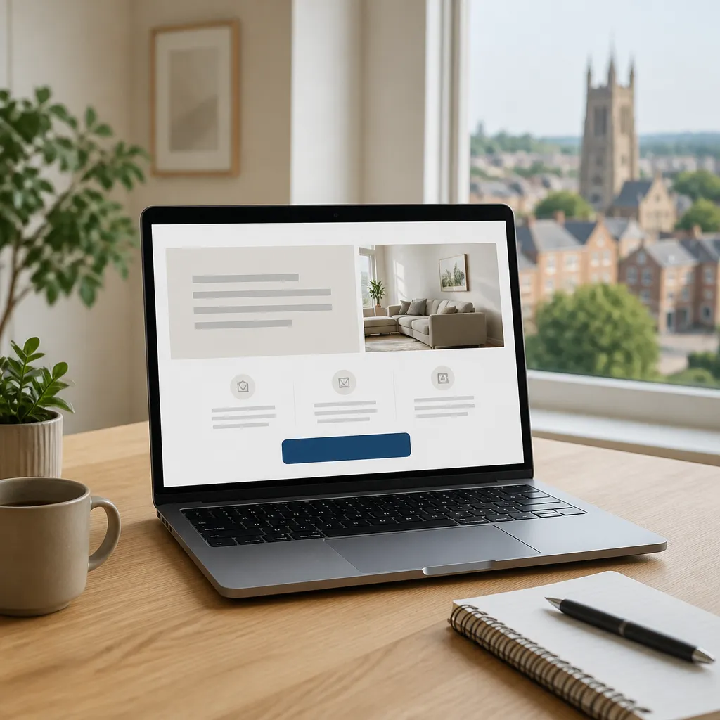
A landing page is built around one outcome. It exists to get a specific visitor to take a specific action, such as requesting a quote, booking a roof survey or claiming an offer. Every element, from the headline to the form, pushes toward that single step.
Unbounce describes landing pages as focused pages made for a specific goal, with one main message and very few distractions. Leadpages makes a similar point: a homepage informs people about your entire business, while a landing page promotes a specific product, service or event. In practice, that is the distinction that matters most.
Many small business sites look like landing pages with a menu bolted on. A tradesperson’s homepage might have a large hero image, a phone number and a list of services, which is close to a landing page. The difference is that the homepage still offers the full site, while a landing page removes most of the exits.
The confusion also comes from shared content. Both pages can carry the same logo, testimonials and service summary, so people assume they are interchangeable. Leadpages points out that the biggest difference lies in each page’s job, not in how it looks.
A simple test helps. Ask what one action you want the visitor to take, then check whether the page makes that action the obvious next step. If the page lists six services, three locations and a blog feed, it is still doing the homepage’s job, however attractive it looks.
A landing page should pass this test in under ten seconds. A visitor who clicks a Google Ads result for drainage work in Nottingham should see the offer, the price or the next step, and the button to press, without hunting. If they have to think, part of the enquiry is already lost.
Pro tip: Write the landing page headline before any design work starts. If you cannot state the offer in one sentence, the page is not ready to build, and no amount of styling will fix that.
A good homepage summarises the business in a way a stranger understands within seconds. It should name what you do, who you do it for and where you work. For a business in Derby or Ilkeston, that location should be visible on the first screen, not buried in the footer.
Leadpages notes that a homepage usually occupies your root domain, receives most of its traffic from organic search and links to every other important page on the site. That makes it the page most likely to be found by people who do not yet know exactly what they want. Treat it as an index of your business rather than a sales page.
The homepage should carry the main navigation because its visitors are still exploring. Keep the menu to the handful of categories people actually search for, such as services, projects, pricing and contact. A menu with twelve items tells the visitor that you have not decided what matters most.
The iBrand guide to conversion rate optimisation for small businesses advises owners to simplify navigation so users can find what they need. That advice applies most strongly to the homepage, where the job is to route people, not to close them.
A homepage usually carries a broad call to action, such as Get in touch or View our services. That is the right level of commitment for a visitor who is still comparing providers. Asking a first-time visitor to book a call straight from the homepage often produces fewer enquiries than offering a route to the right service page.
Because the homepage links to everything, it also spreads internal links across the site. Those links help search engines find your service pages, which is why we build homepages around clear category links rather than one long sales pitch.
Pro tip: Check your analytics for the pages where visitors leave most often after the homepage. If people drop off quickly, the opening headline or the navigation is usually the cause, not the colour scheme.
The traffic source should influence which page a visitor sees. A homepage tends to attract people searching for your brand or for broad category terms, while a landing page is usually the destination for someone who clicked a specific ad, email or social post. Sending paid traffic to the homepage wastes that intent.
A landing page that matches the ad keeps the promise the visitor was sold. A homepage that ignores the ad breaks it.
Most organic visitors to a business homepage arrive through brand searches and general category searches. Someone typing the name of a local plumbing firm, or searching for tradesmen websites in Derby, wants to see who you are and whether you look credible. Your homepage has to answer that quickly, with clear location and service terms.
Local SEO work usually strengthens the homepage first, then points visitors to dedicated service pages. Those service pages can be written in landing page style, but they still sit within the site and link back to the main navigation. That is the trade-off with organic traffic: visitors arrive with curiosity, not a specific offer in mind.
Google Ads and Facebook Ads send people who have a specific reason to click. A person who searched for emergency boiler repair in Ilkeston expects to see that exact service, a phone number and a clear next step. If they land on a general homepage, they must search for it, and many will leave.
This is where a sponsored ads budget is either used well or wasted. We would rather a client spent less on clicks and sent every one to a focused page with a single offer than spread the same budget across a homepage that serves everyone. For paid campaigns, the landing page is not optional.
Traffic from email newsletters and social posts behaves more like paid clicks when the message is specific. A post promoting a free roof survey, for example, should link to a page about that survey rather than the company homepage. The more precise the promise in the post, the more closely the destination should repeat it.
Unbounce’s guidance on landing pages stresses matching the messaging and design to the campaign that sent the visitor. That match is why a dedicated page usually converts better than a shared one, because the visitor sees their question answered at once.
A landing page earns its keep through structure rather than decoration. Neil Patel’s collection of landing page examples describes strong pages as sharing a few structural fundamentals, including a value proposition above the fold and one clear call to action. Those two elements are where most small business pages fail first.
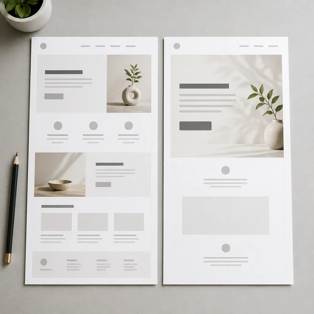
The headline should state the service, the place and the outcome. A line such as Roof surveys across Derbyshire with same-week reports does more work than Welcome to our website. Place the offer and the call to action in the first screen on both phones and desktops, because many mobile visitors never scroll.
Keep the supporting line short. One sentence explaining who the offer is for is usually enough, followed by a second line about what happens next. Anything beyond that belongs lower on the page.
Remove the main menu from paid campaign pages, because every link is an exit. Leadpages observes that landing pages usually strip out navigation to stop visitors clicking away. That does not mean stripping out credibility. Keep the company name, a phone number and a short note about where you are based.
A common mistake is removing everything, including the reassurance a local buyer needs. A homeowner asking for a quote wants to know the business is real, insured and nearby. Put those signals close to the form, not in a footer nobody reads.
Local proof is more persuasive than generic praise. A testimonial that names a job in Nottingham or Ilkeston, with a short description of the work, will do more than a star rating with no context. Photographs of completed work, where you have permission to use them, support the same claim.
Make the proof match the offer. If the landing page sells drone roof surveys, show a sample survey summary or a short case description. Visitors should see evidence that matches the thing they are being asked to buy.
Pro tip: Test the form on a phone before launch. Every extra field costs enquiries, so ask only for what you need to call the lead back.
Conversion rate optimisation is the work of increasing the share of visitors who take the action you want. For most local firms, that means more calls, form completions or quote requests from traffic you already receive. It is usually cheaper to fix a page that gets visits than to buy more clicks for a weak one.
The iBrand tips for small businesses start with understanding your target audience, then simplifying navigation, then using clear calls to action. We agree with that order. Testing before you know who you are talking to only tells you which mistake is less bad.
A/B testing sends different visitors to two versions of a page so you can compare results. Unbounce covers A/B testing in its landing page resources. For a small business, the practical version is simpler: change the headline or button text for a month, then compare enquiries with the month before, accepting that seasonal shifts can distort the result.
Change one thing at a time where you can. If you change the headline, the photograph, the price and the form in the same week, you will not know which change helped.
Watch the conversion rate on each landing page, not just total site traffic. For example, 10 enquiries from 200 visits is a 5 percent conversion rate, while 10 enquiries from 2,000 visits is 0.5 percent. The comparison only makes sense per page and per traffic source.
Check which campaign produced each enquiry, too. A page can look weak overall while one ad group delivers strong leads, and that insight tells you where to spend next.
Slow pages and cramped mobile layouts lose enquiries before the copy has a chance to work. Test the page on a mid-range phone over a weak connection, which is closer to how many local clients will see it. If the offer is hidden behind a slow image carousel, fix that before rewriting anything.
Trust signals such as accreditations, clear contact details and a real business address help visitors decide quickly. Place them near the call to action rather than on a separate page they may never open.
The table below compares three page types that East Midlands businesses commonly use. The right choice depends on where visitors come from and what you want them to do next.
Choose a homepage when the visitor is still deciding whether you are the right provider. Choose a dedicated service page when the visitor knows the service and needs proof. Choose a landing page when you are paying for the click or when a campaign needs one clear result.
| Page Type | Best Traffic Source | Main Job |
|---|---|---|
| Homepage | Brand searches and general organic searches | Introduce the business and route visitors to the right section |
| Service page | Local searches for one specific service | Explain that service in depth and build trust |
| Landing page | Google Ads, Facebook Ads and email campaigns | Drive one action, such as a quote request or survey booking |
None of these pages is better in general. A landing page with no homepage behind it can look untrustworthy, and a homepage that tries to close every sale is usually too crowded. The work is making each page do its own job well and linking them in a sensible order.
In practice, the strongest sites we see use the homepage to introduce the business, service pages to explain each offer and landing pages to capture paid or campaign demand. Each one feeds the next.
Most landing page problems come from a handful of habits. The same errors appear across trades, retailers and professional services in Derby, Nottingham and Ilkeston. Fixing them usually costs less than buying more traffic.
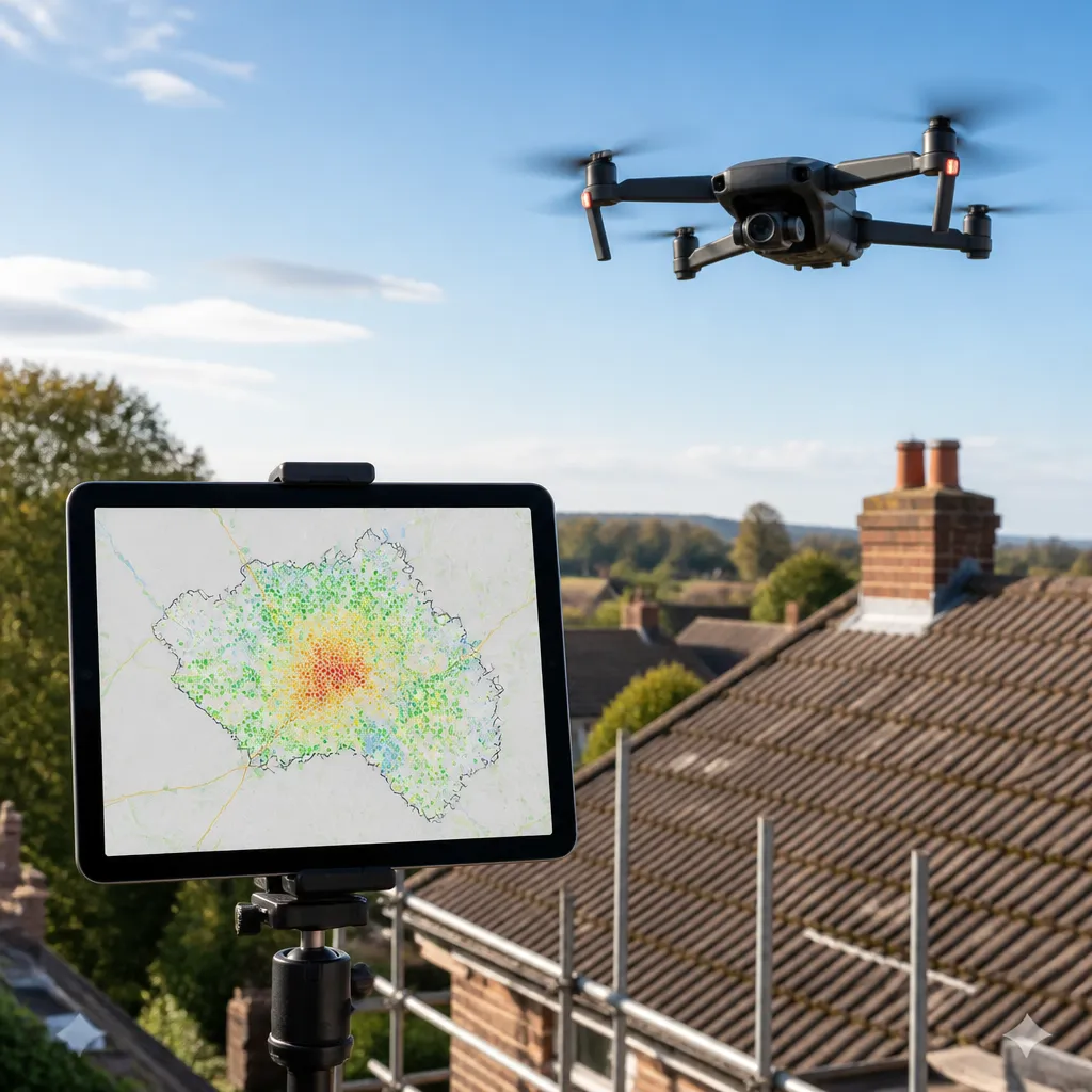
This is the most common error. A business runs Google Ads for a specific service, then sends every click to the homepage because it is the easiest link to copy. The visitor sees a general introduction rather than the service they searched for, and the budget produces fewer enquiries than it should.
The opposite mistake is building a single landing page that tries to sell everything. Once a page carries five offers, the visitor has to choose, and most people will not. Separate pages for separate offers keep the message tight and the measurement honest.
The enquiry is not the end of the journey. A thank you page that confirms what happens next, when the lead will be called and what to prepare, reduces anxiety and cuts repeat enquiries. Many businesses skip this step, sending visitors to a blank confirmation message.
Pro tip: Create a short thank you page for each main landing page and state the exact next step, such as a callback within one working day. Only publish that promise once you can keep it.
No. A homepage introduces the whole business and links to the rest of the site, while a landing page is built to drive one specific action. The two can look similar, but their jobs are different.
Usually not. Paid visitors clicked for a specific reason, so they should land on a page that matches the promise in the ad. A dedicated landing page with one offer and one call to action normally produces more enquiries.
Costs depend on scope, the number of revisions and whether copy, photography and tracking are included. Ask any provider for a quote that lists exactly what is included, and be wary of vague estimates without a breakdown.
There is no single benchmark that suits every industry. Compare each page against its own history and against the same traffic source over time, measuring enquiries per visit and changing one element at a time.
Yes, if you run paid campaigns, send email promotions or want to sell one specific service. A strong homepage helps people who already know your name, but it rarely converts a cold click for a specific offer as well as a focused page does.
You can, but location-specific pages usually perform better for local search and paid clicks. Mention Derby, Ilkeston, Nottingham or Derbyshire only where you genuinely work, and back the claim with real project examples.
Have you split your homepage into dedicated landing pages for paid campaigns, and what changed in your enquiries?